
This Friday we launched the new logo / branding for Rivers & Robots. Over the past 6 months we've been working on a redesign including new typography, colour schemes, logo marks etc. We rolled out the updated 'R&R Ring' across our social media platforms and website on Friday and also released a new video talking a bit about the rebrand (as well as an update on our Gather event). You can watch that below!
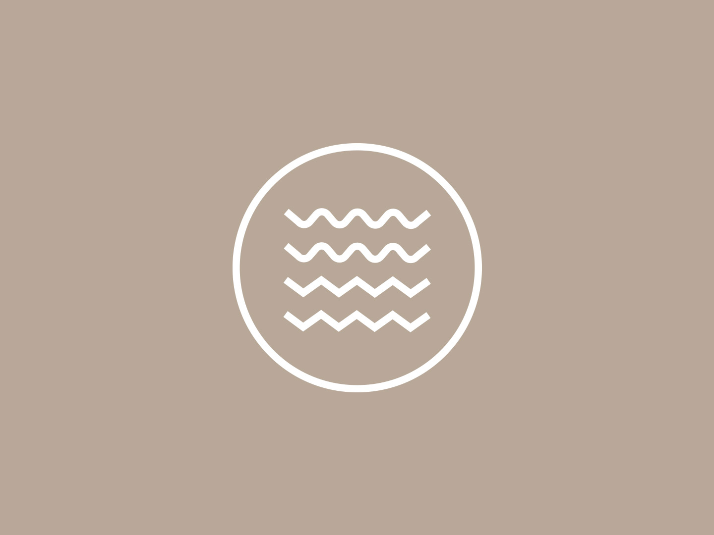
'Waves' logo mark
The overall theme of the branding is to modernise the brand through clean lines and simpler typography - aiming to bring a modern / urban look to the band. The new visual language includes a simple 'waves' logo mark, a type treatment of the full band name, and a simple R&R 'ring' design. The waves design features a subtle nod to the name Rivers & Robots, with the top two lines taking on a more curved wave (representing rivers) and the bottom two waves being made through straight angular lines (representing robots), this design is an extension of an old t-shirt design used as tour merch used at The Eternal Son live shows across Europe and USA.

Word mark, distorted through water.
Tying in to the theme of water in the band name and also in many of the song's lyrics, some of the typography is warped by taking photos of the words underwater and allowing the surface of the water to distort the lettering.

A new range of band merch will be launching soon to coincide with the new branding. And we'll continue to reveal more of the design work as the next album cycle comes along!
